
Jaxsons: Café & Bagels
Branding & Identity
Jaxsons is a local café and bagel shop in Jacksonville, Florida.
Called ‘Jaxsons’ after the unknown nickname of Jacksonville residents. They are proud to be a part of Duval County their brand features elements that highlight the uniqueness of Jax. This café has coffee that is locally roasted in Jax, as well as a bagel shop that features unique flavors.
Overview
Jax locals
Adults 18-35
Coffee and bagel lovers
Students or employees that like to work at cafés
Target Audience
Brand Guidelines
This logo was created with a custom font designed in a previous group project. The font is rounded and relaxed to reflect the friendliness of Jaxsons. While the O is turned into a coffee bean to reflect the café part of the brand.
Logo Concept
Primary Lockup
Logo Variations
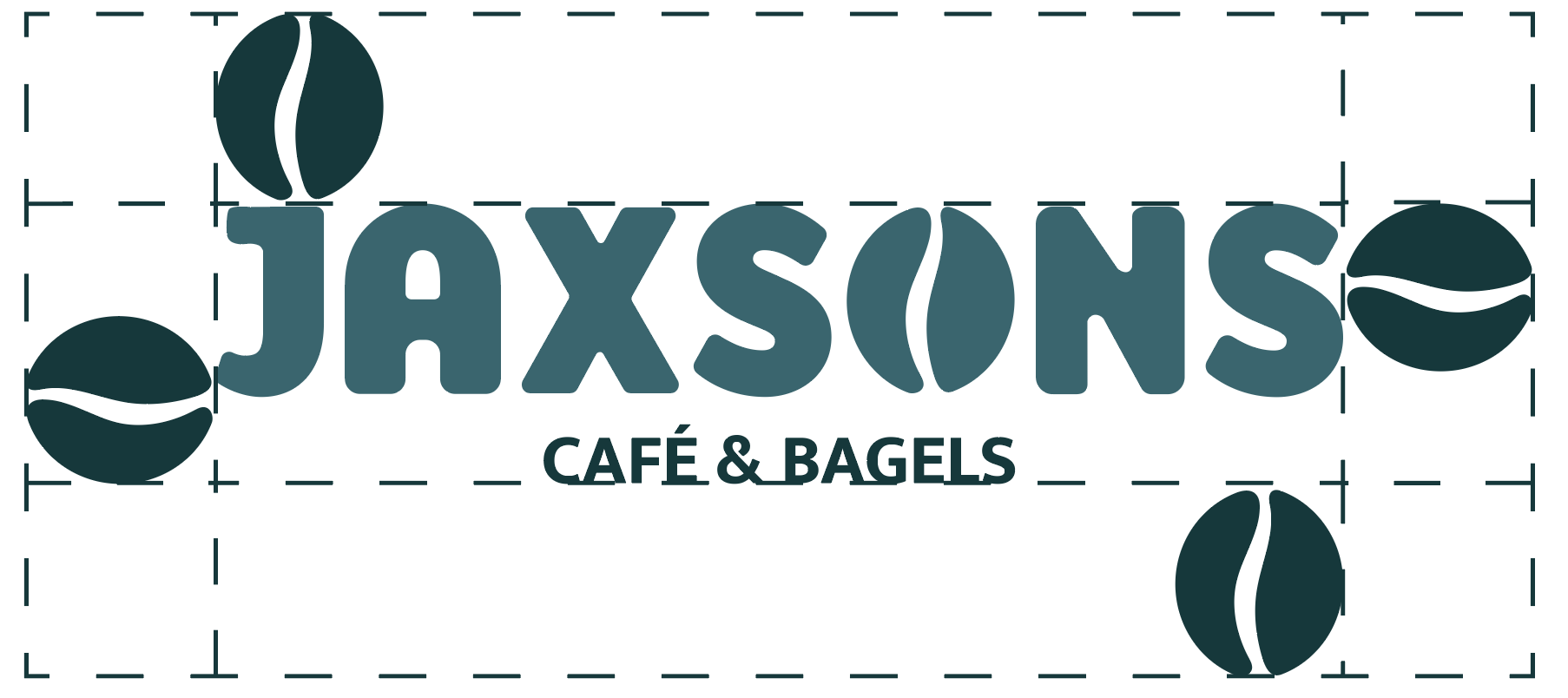
Exclusionary Zone
Color Palette
They were chosen to represent Jacksonville. With a cool-toned color palette that shows the bright blue of the ocean to the dark teal of the St. Johns River. They complement each other while providing a calming feel to the atmosphere of the café.
Typefaces
Jaxsons was a custom typeface designed by my group and me in the previous project. I decided to keep the typeface we designed as it still held the brand’s personality and structure.
Mukta is the secondary type that is used primarily in the tagline and logo description.
This pattern features fun icons that represent Jacksonville, Florida. From our sports to our beaches, the personality of Jax is brought to life through this colorful pattern.
Brand Pattern
The store front features the logo at the top of the white building. The brand’s pattern and tagline in on the store’s window, bringing the personality of the brand to the front as people enter.
Store Front
The digital menu is featured on a TV inside the café, created with a contrast between the colors and organized into boxes to be more reader-friendly.
The print menu would be offered at the register or while people wait in line. At the bottom features the nutrition and allergy notices. As this would be an establishment that can handle food allergies such as gluten and dairy.
Menu Designs
For hotter drinks, they would receive the cup with the darker blue design, as the colors reflect the darker drinks. While the iced drinks would be placed in the clear cup with bright blue designs reflecting the chilliness for ice.
The drinks carrier remains simple while still representing the company.
Drink Cups & Carriers
The larger bag lets the tagline become the focal point of the design. While the smaller bag expresses more of the pattern with the logo being the focal point. These would be made of recycled paper, and the designs would be stamped onto the bag.
Take-out Bags
Using the brand pattern to surround the logo, creates a fun and engaging coaster. While touching back to the brand’s tagline on the back of the coaster.
Coasters
These shirts are in a darker color to differentiate from the merchandise t-shirts. Saying “Jaxsons Team” creates more of a collaborative environment and friendlier tone from the brand.
Employee T-shirts
These shirts allow the brand to be represented through a playful and fun tone on the back, through the brand’s tagline. They are in a lighter cotton color to differentiate further from the employee t-shirts, as well as a rectangle design.
Merchandise T-shirts


