Anne of Green Gables
Publication, Type Setting & Illustration
Anne of Green Gables is a classic children’s book set in the late 19th century. Telling the adventures of a redheaded 11-year-old orphan girl Anne Shirley sent by mistake to two middle-aged siblings, Matthew and Marilla Cuthbert, on their farm in the fictional town of Avonlea in Prince Edward Island, Canada. Anne is a spirited and unconventional young girl with a wild imagination.
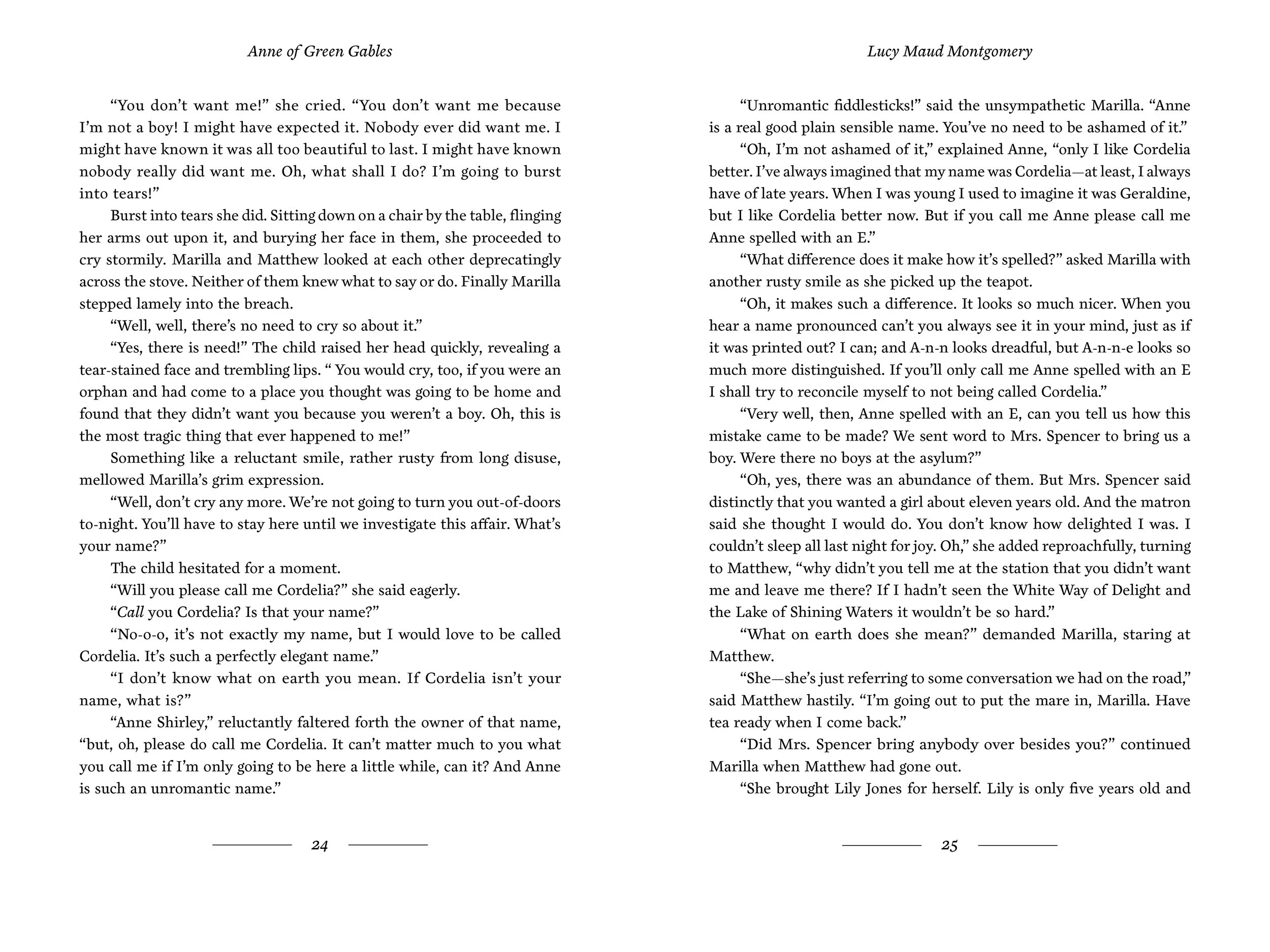
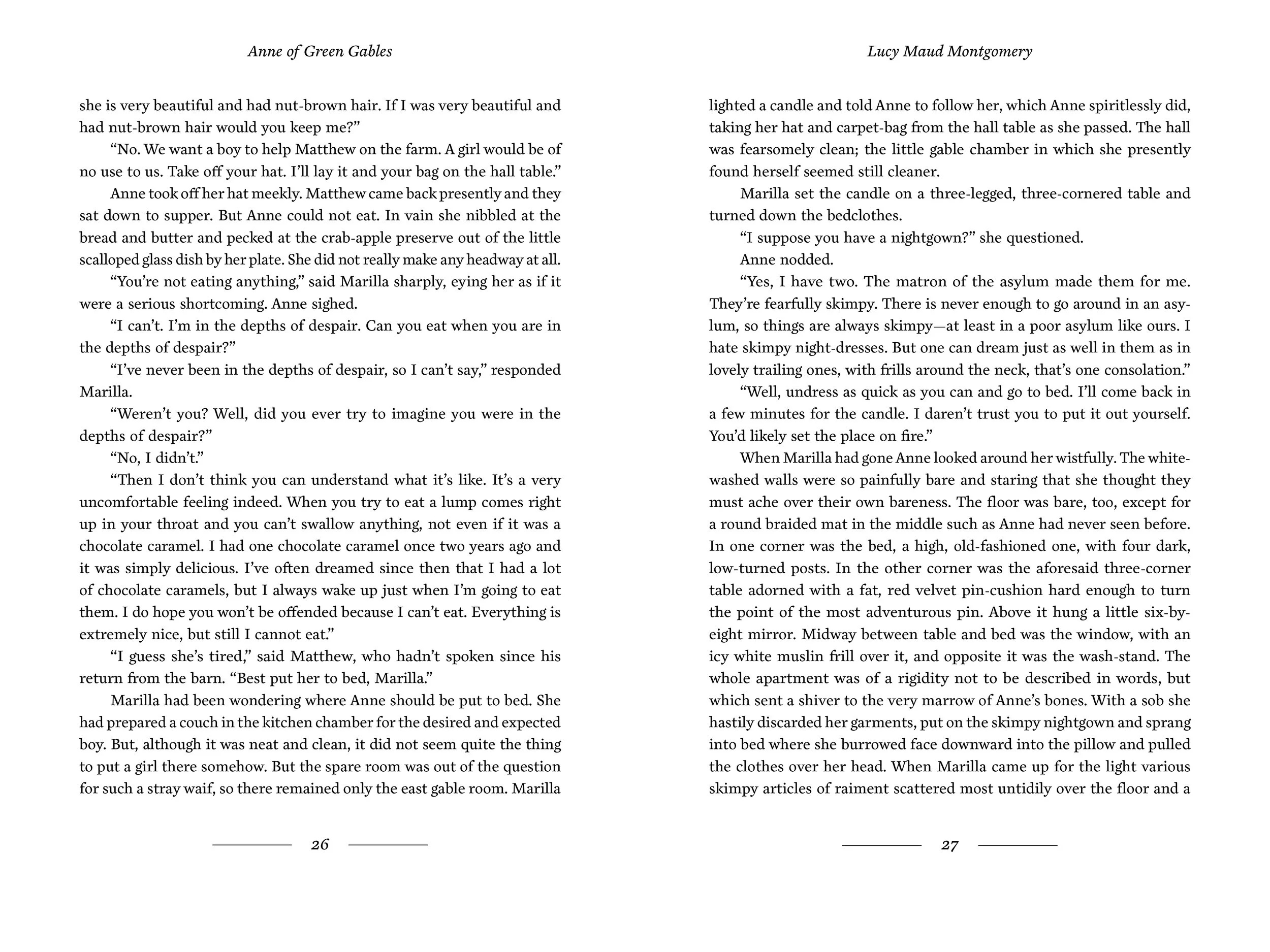
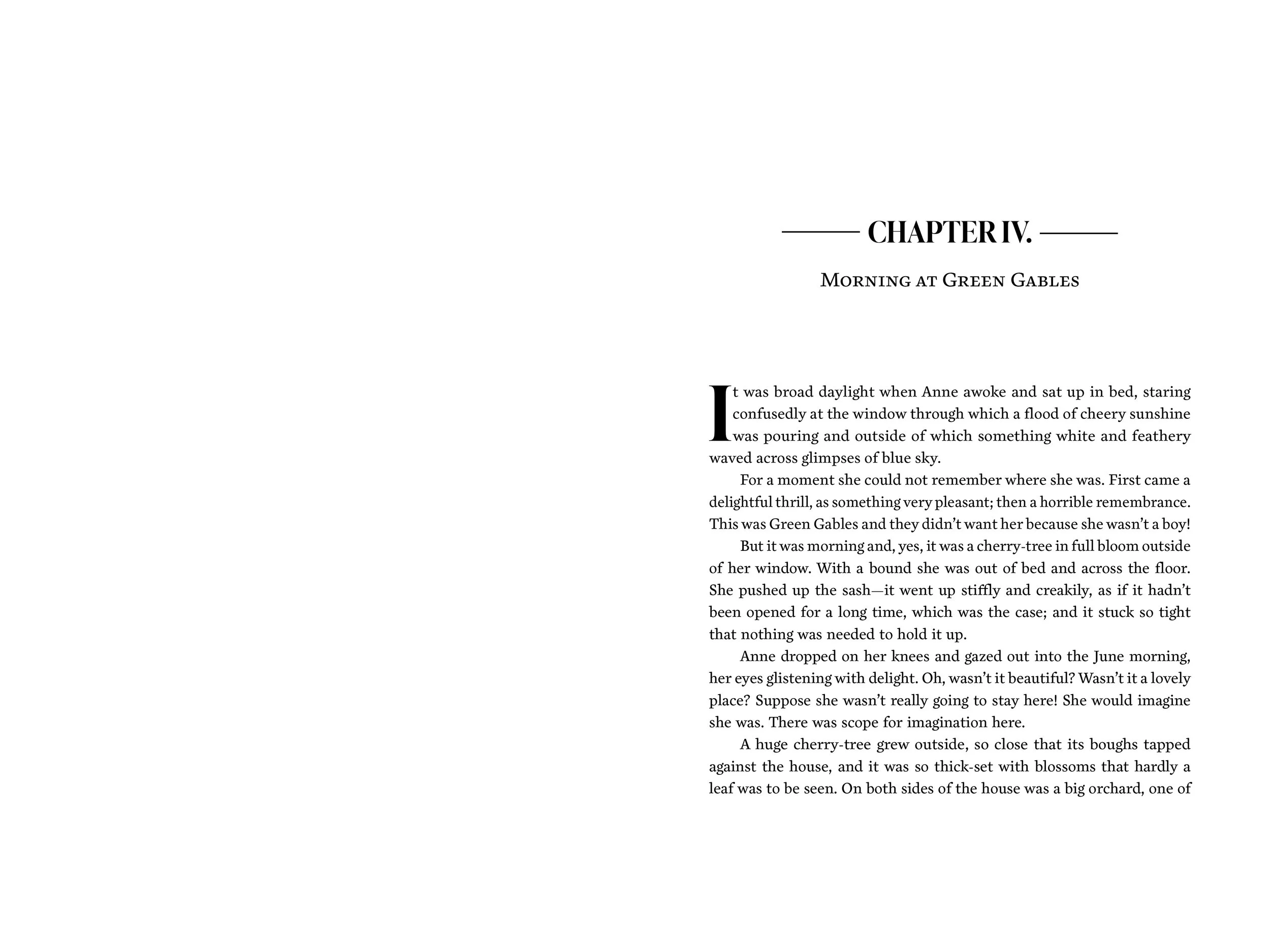
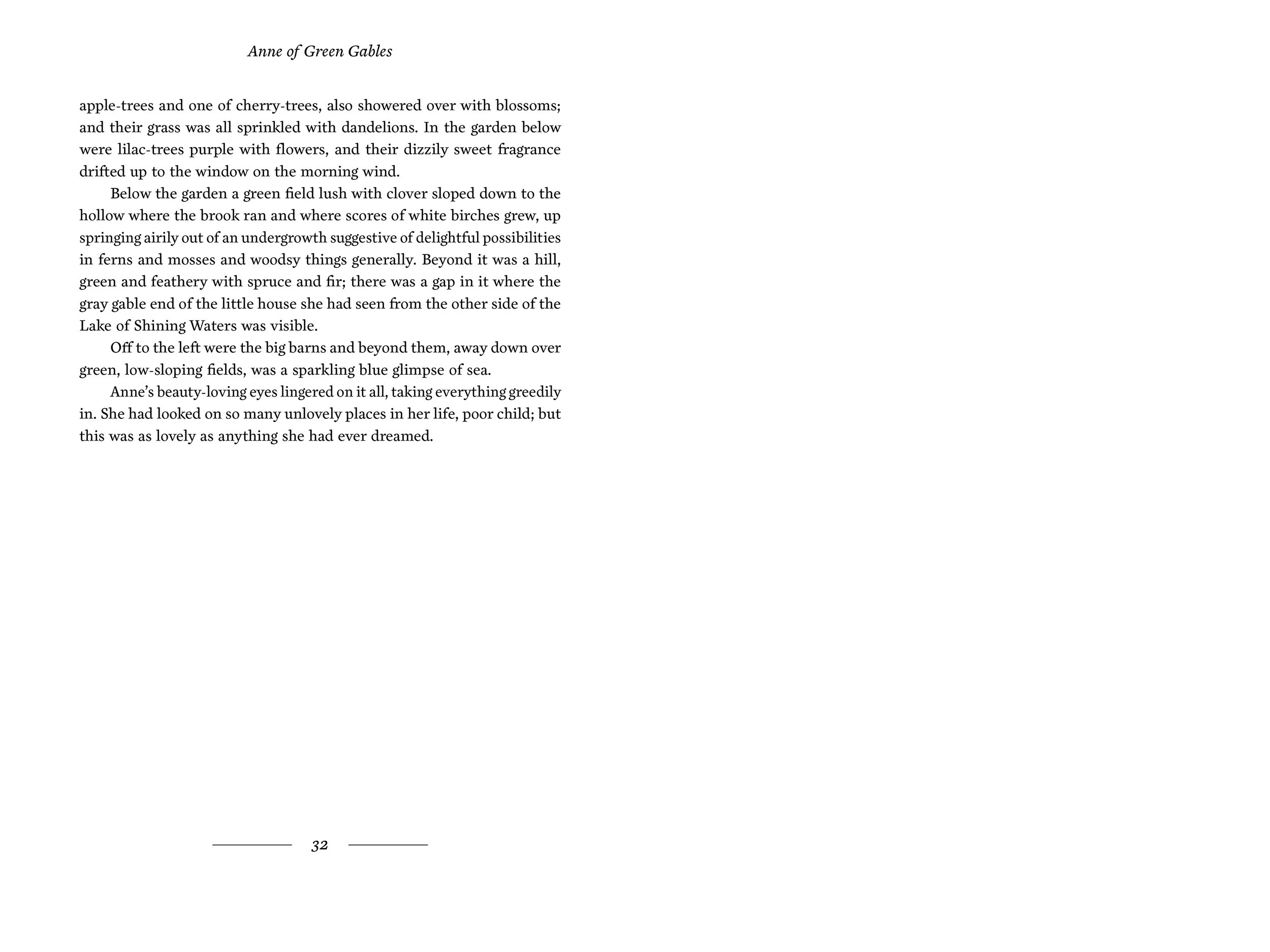
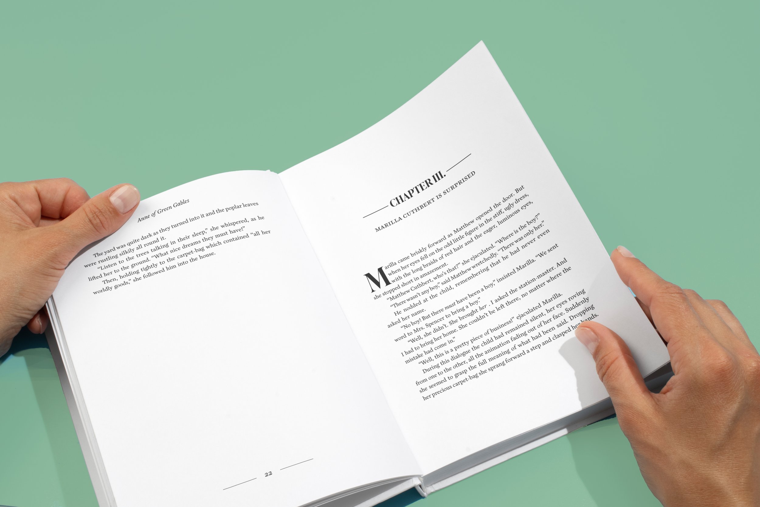
I designed a book cover as well as type-set two signatures of the book’s interior.
Overview
Beloved classic for all ages
Age 10-14 year old girls
Adults re-reading or reading the classic for the first time
Collectible for fans
Type lovers
Target Audience
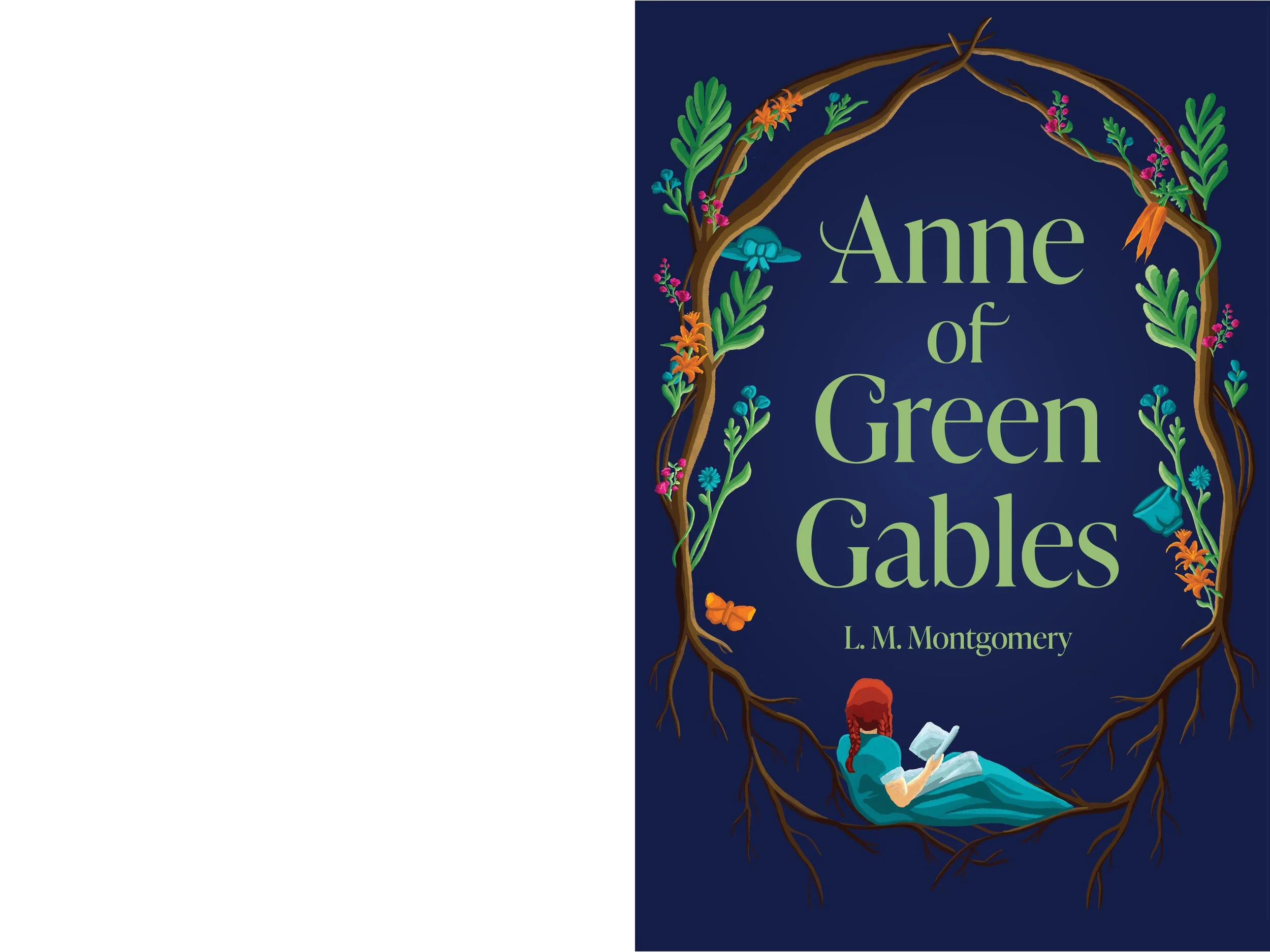
This cover was designed to be minimal and allow the illustrations to stand out from the dark background.
Done in a hand-drawn style, to create texture and purposeful imperfections in the illustrations. This design style creates warmth and a sense of individuality. Reflecting the content of the book and its characters.
This would be printed on a cloth-covered hardcover. As it provides a classic and elegant aesthetic. Embossing would be done with the type to create a further texture and tangible experience for the reader.
The Book Cover
The front cover of the book creates an abstract scene of Anne being cradled by the roots of a tree. This represents her setting down her roots in Avonlea for the first time in her life.
Surrounding her are vibrant flowers and plants, a key feature of Anne’s character. Throughout the book, she talks about flowers and personifies them. She has a love for nature and its beauty. There are also some objects around the flowers as well. Such as the straw hat, tea cup, butterfly, and carrots. Each alludes to her personality, such as the butterfly being a symbol of her growth in Avonlea.
The back cover of the book shows the Green Gables house. Like the front cover, it is gently placed in the roots. Showing the physical location of Anne’s roots.
The Illustrations
Type Choices
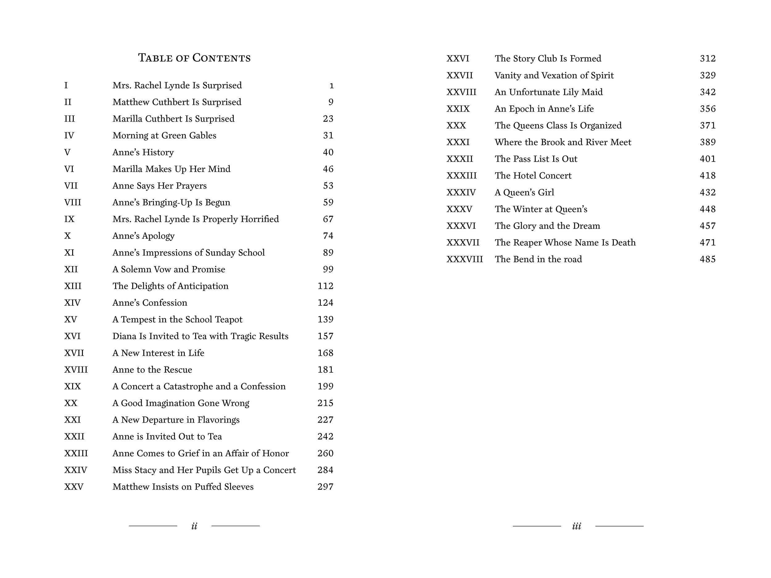
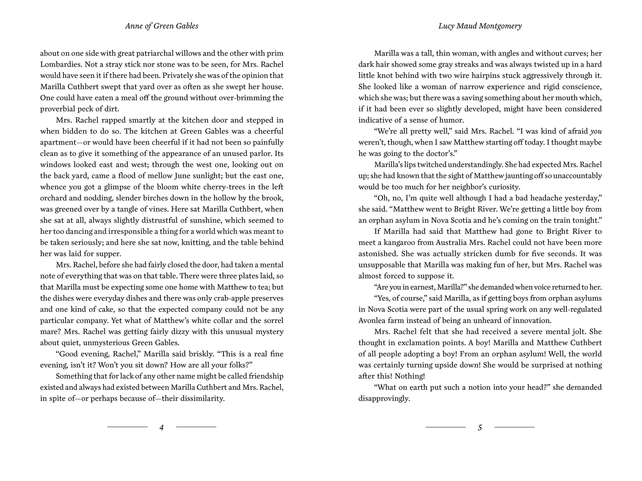
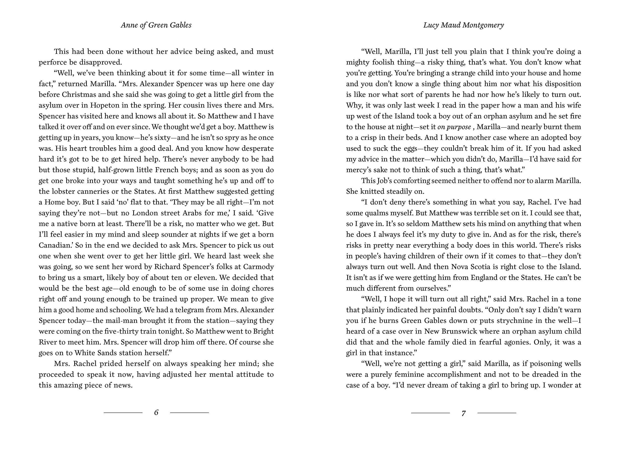
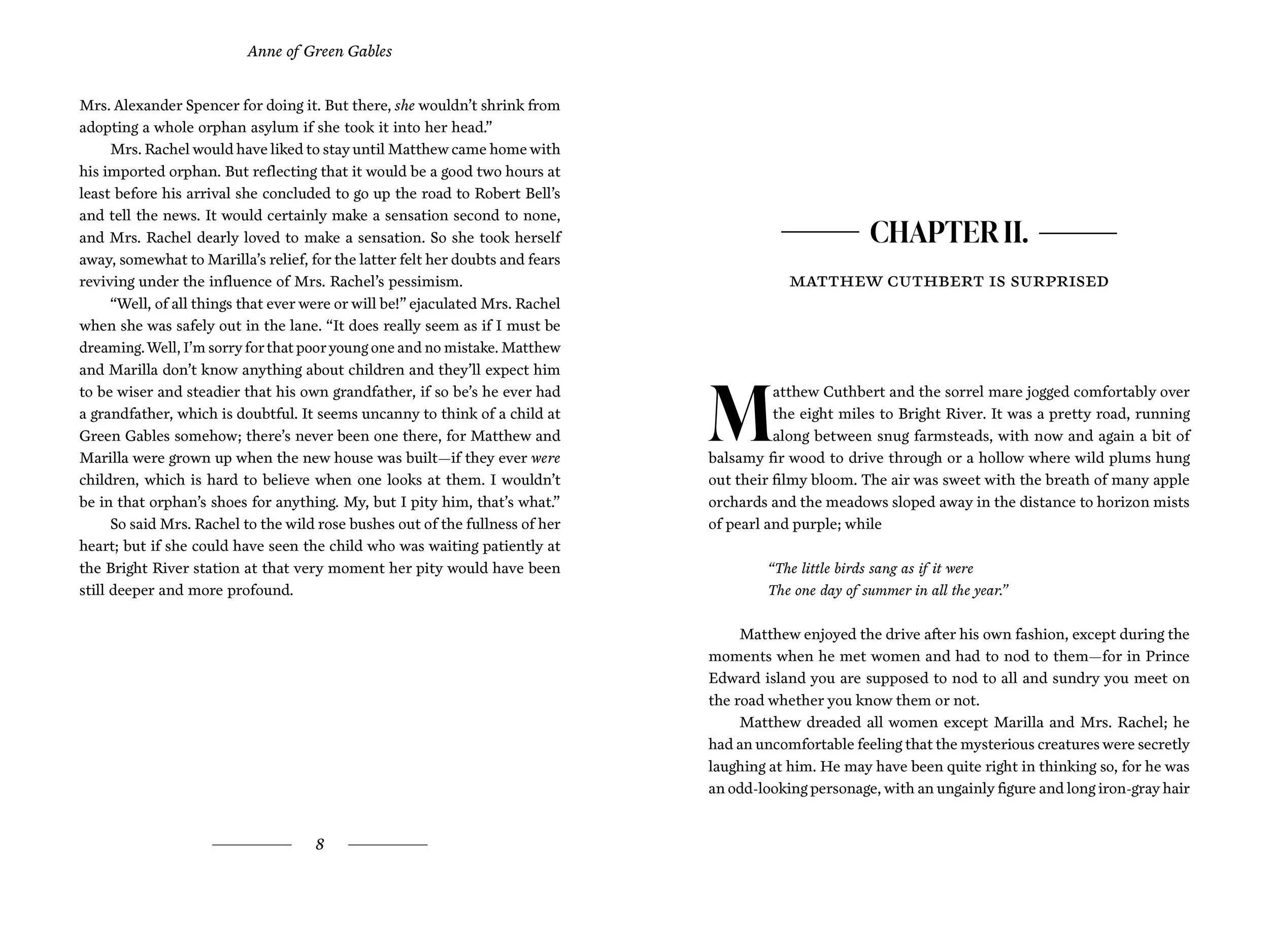
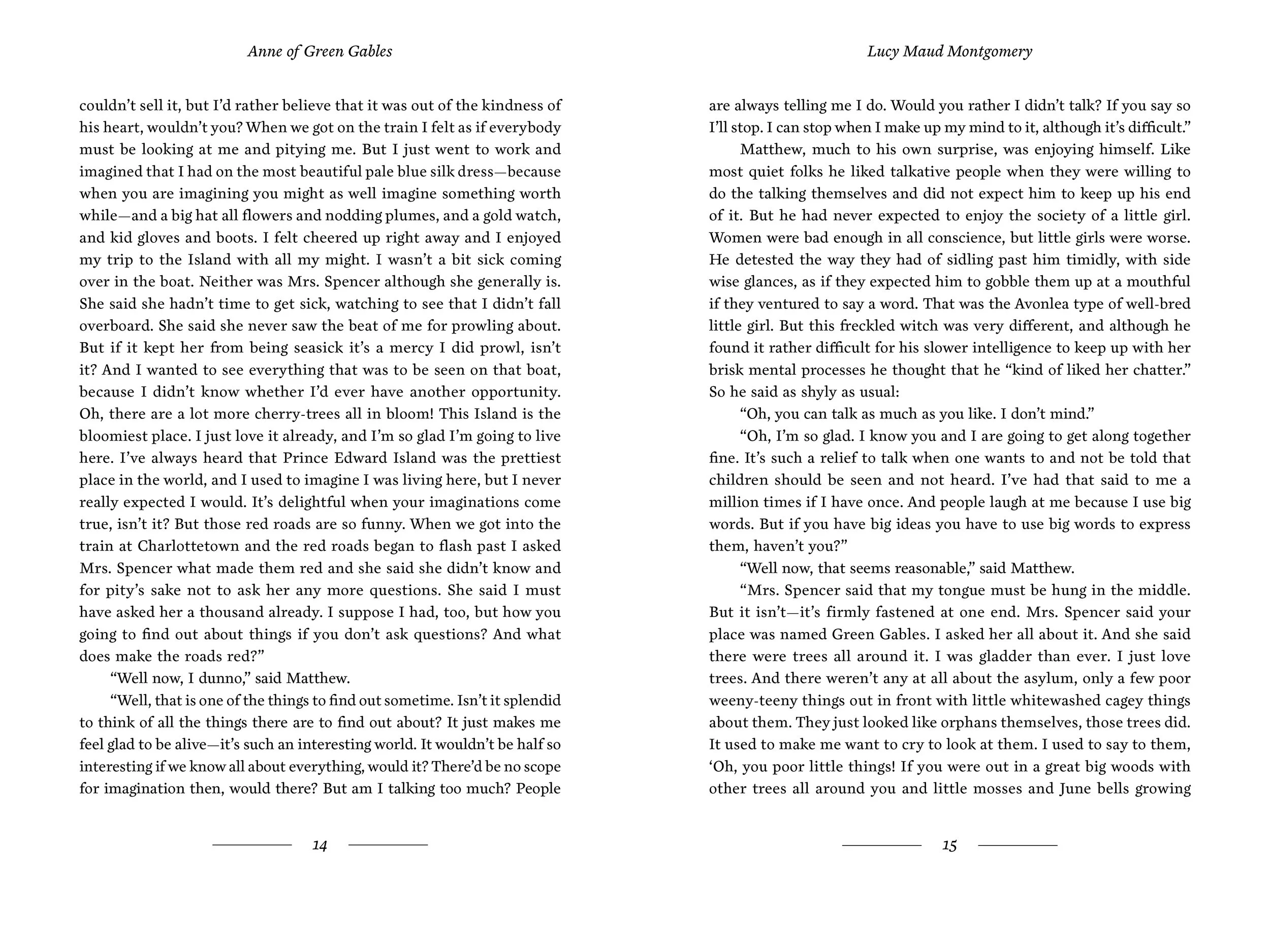
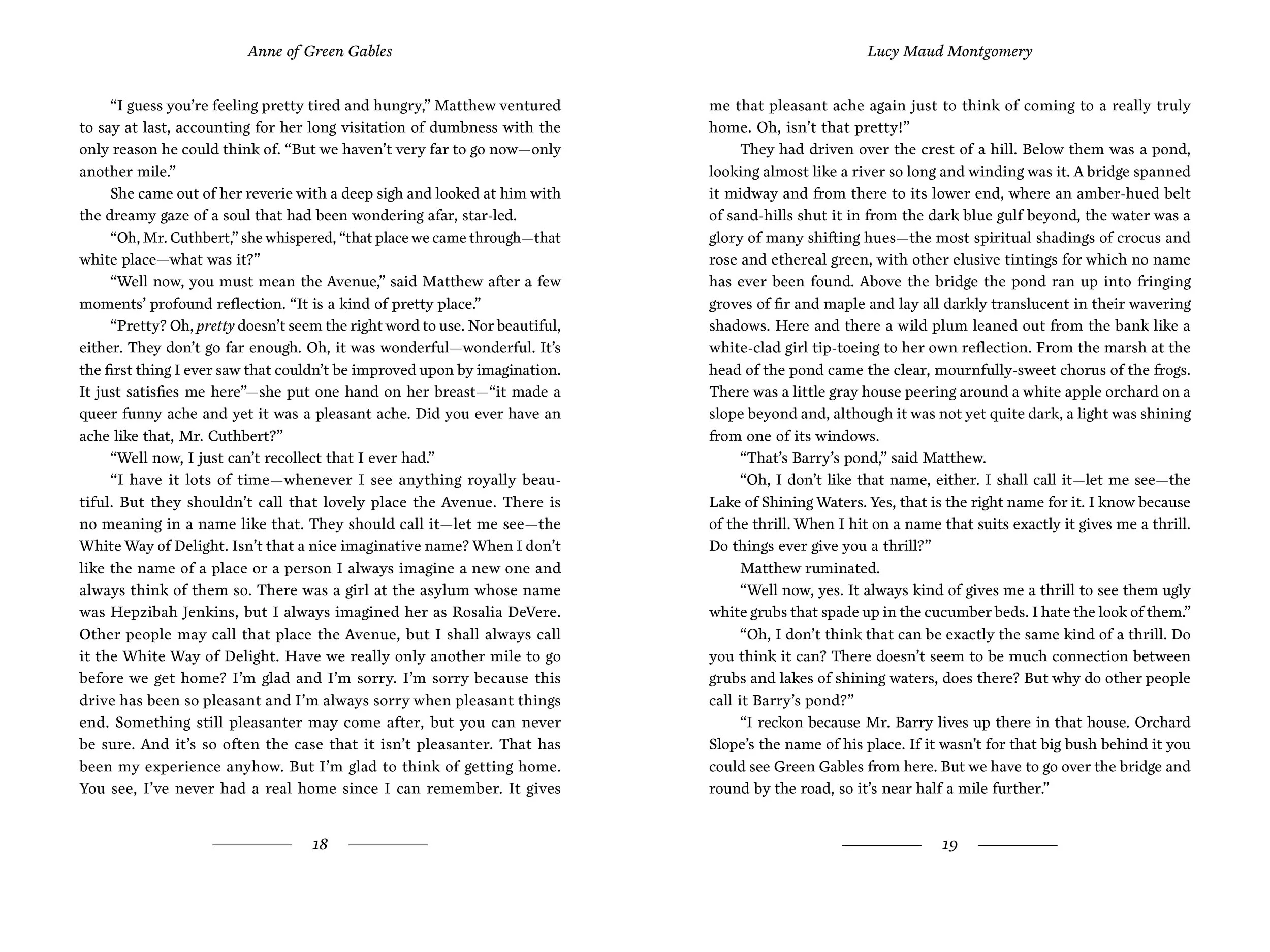
For the body copy typeface, it was important for me to choose a typeface that had the personification of Anne and the tone of the book. So I decided on the Cardea OTCE typeface, as it was rare and refreshing. The typeface appears as if it was almost carved, alluding back to the history printing of a book. And it appears kinetic and sturdy at the same time, giving it a playful look. Cardea OTCE was also designed by David Cabianca who teaches in Toronto, a nod to the author’s country.
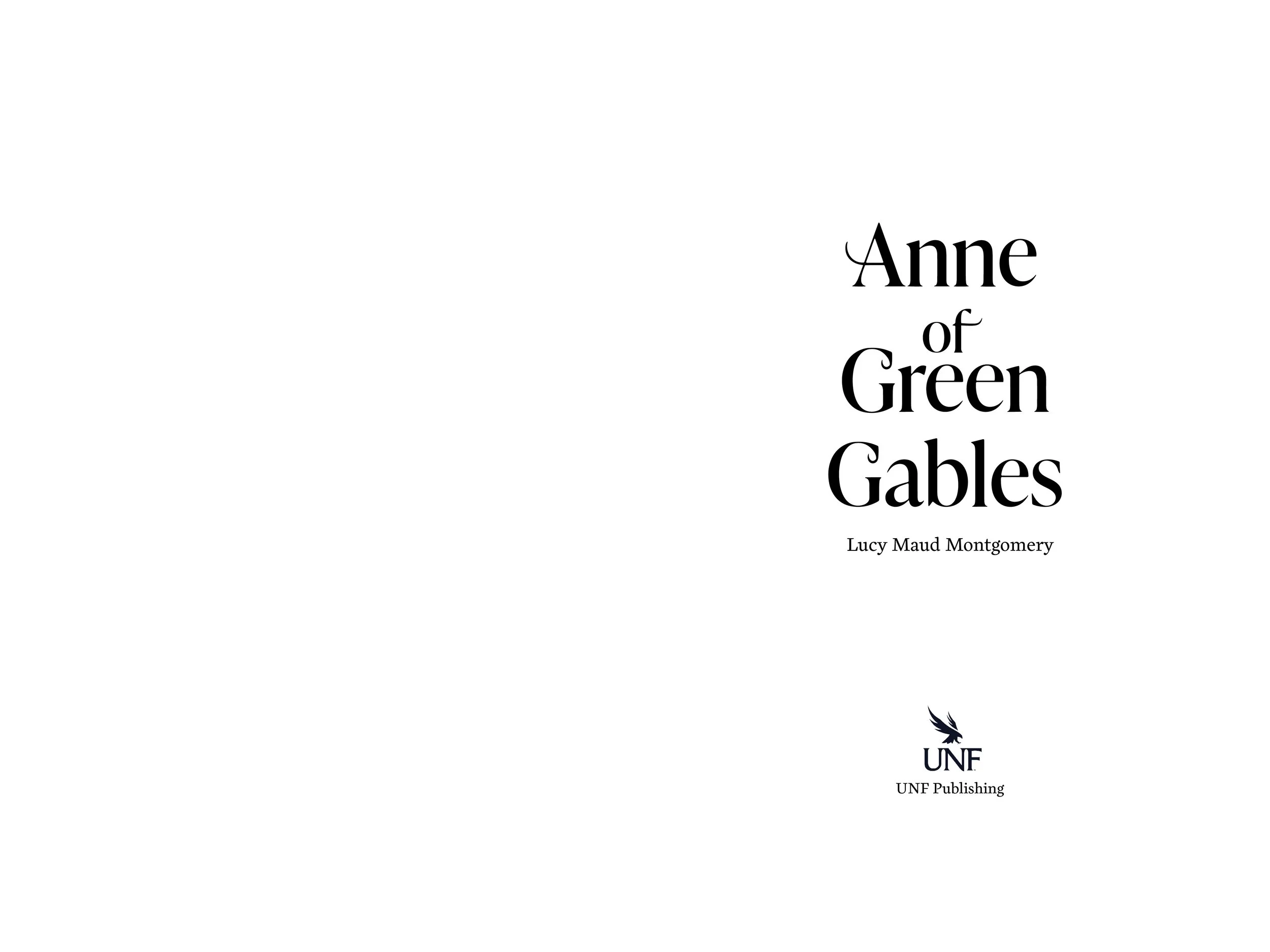
The pairing typeface for the displays was IvyPresto Display, designed by a type foundry in Denmark. IvyPresto Display has that same structured feel to it while accomplishing the sophisticated look I originally intended for the typesetting.
Both typefaces balance each other out well, as IvyPresto has more contrast while Cardea is bold but readable.
Formatting Details
6" x 9”
Margins,
Head: 0.8333 in
Foot: 1.5 in
Fore-edge: 0.75 in
Gutter: 0.7 in
Lines per page: 32
Typefaces:
Cardea OTCE (body copy)
size: 10.5 pt
IvyPresto Display (display)
size: 58-80 pt
Cardea OTCE italics (running content)
size/leading: 11pt/15pt
Type size: 10.5 pt
Leading: 15 pt
Characters per line: 15 - 75


