
Gemütlich: Wood Furnishings
Branding, Publication & Web Design
Gemütlich is a luxury wood furnishings company based in Munich, Germany, and ships globally. “Gemütlich” is the German word for a comfortable and cozy atmosphere.
Each piece is handcrafted by local carpenters, and created from designs that merge the vintage and modern style.
The pieces are known for their sleek and high practicality, as each piece brings a sense of character into the home. Gemütlich takes pride in sustainably sourcing trees and the craftsmanship behind each piece.
Overview
Upper-middle class
35-65 years old
Monthly income above $1500
Lives or desire to live a luxury lifestyle
Target Audience
Brand Guidelines
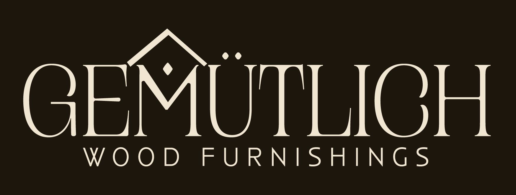
The brand’s name derives from the comfort and the sense of coziness. It was apparent to depict a similar feeling in the logo while maintaining a luxurious tone. That tone is achieved through the contrasted serif, which is sturdy and structured.
The ‘M’ has an abstracted home at the top. With a diamond symbol in the center reflecting the heart of the home. The symbol appears to be similar to the umlauts on the ‘U,’ while remaining clear it’s not a linguistic mark.
Logo Concept
Primary Lockup
Secondary Logo & Icons
Color Palette
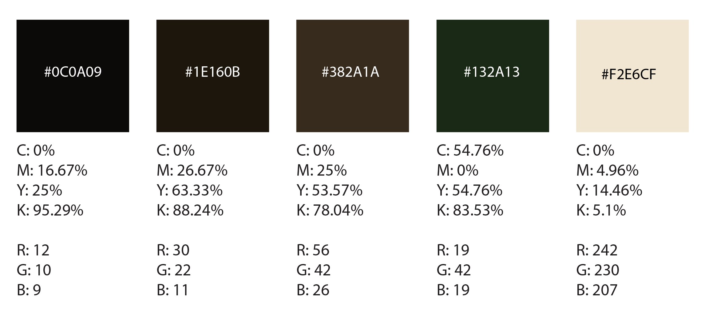
These colors were chosen for the dark ambience created, but the warmth and they evoke a needed sense of comfort in a home. Creating depth and relaxation, while also showing the source of the furniture through the dark forest green.
Typography
Campaign Serif, is the primary typeface which had minor customization. Such as making the type thicker and adding in the umlaut mark. This typeface has wide proportions and lively curves with subtly curved terminals that are crescent-shaped.
Anisette Std Petite, chosen for its history of an Art Deco typeface. This connects the vintage tone and values of the brand. Connecting their mission of connecting the past and present through the two typefaces.
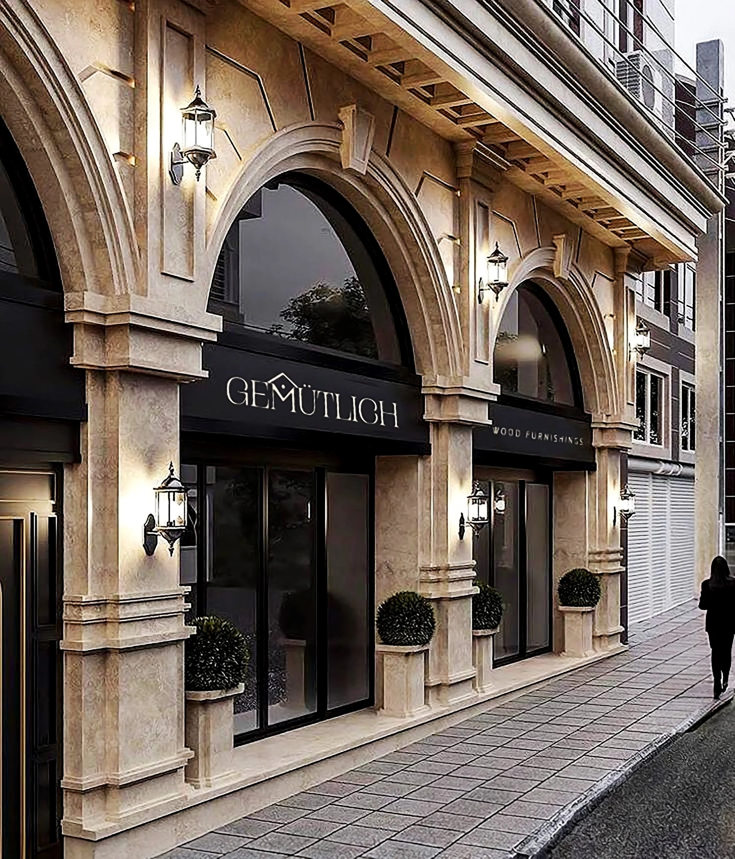
This is Gemütlich’s flagship store, reflecting their branding through warm-toned stone and dark accents. The architecture reflects the unification of both vintage and modern styles. Through the neoclassical architecture features, but bringing a more modern look to the storefront.
Storefront
Their tags are made from recycled materials and use the excess leather to make the ties. They stamp on the type, making the tags more handcrafted like how their furniture is. On each tag they credit the carpenter who made the piece.
Furniture Tag
This is Gemütlich’s flagship store, reflecting their branding through warm-toned stone and dark accents. The architecture reflects the unification of both vintage and modern styles. Through the neoclassical architecture features, but bringing a more modern look to the storefront.
Business Card
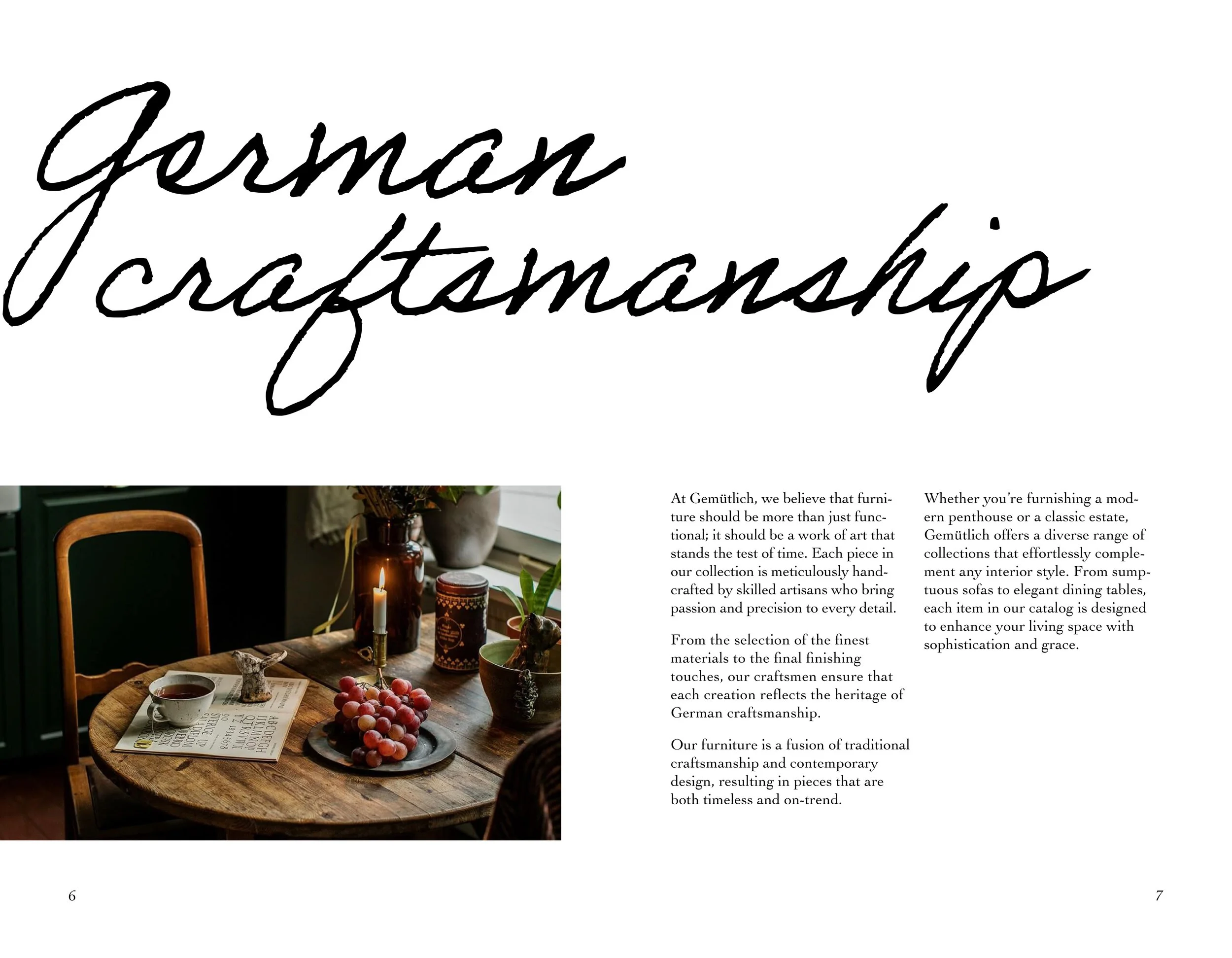
This annual catalog is sent out to their mail subscribers or to those who request the catalog on their website.
Featuring their newest furnishing collection. Focusing on the craftsmanship of this collection and the roots of the brand.
2024 Collection Catalog
Flip through the catalog spreads below ↓
The landing page features aspects of the brand and its values. Showing different collections of their furnishing to their sustainability promise. Creating a touchpoint of the brand and how they present themselves to the digital world. Designed for both desktop and mobile.
Web Landing Page
The landing page features aspects of the brand and its values. Showing different collections of their furnishing to their sustainability promise. Creating a touchpoint of the brand and how they present themselves to the digital world. Designed for both desktop and mobile.
Web Landing Page


